
Sitting here on the last business day of July, I am looking around the office surrounded by almost nothing but new products. With students returning to college in person and universities allowing 100% capacity at athletic events, we are primed to offer returning and future customers more products than ever before.
With 10 new university licenses, we proudly offer well over 600 unique products in our catalog. This blog is a quick rundown of everything new this summer and what you can expect in the fall. Since this is your first time back on campus, tailgating, and watching your favorite college athletic event, you have to dress the part, right?
New Licenses
Way back in January (almost 6 months to the date of writing this *mind-exploding emoji*), I shared our new universities with you, but to be honest, when I wrote that, those products were so new that we really didn't know what to expect outside of some rough market research and comparing enrollment and alumni data to our other licenses. Since then, we've added 4 brand new universities that are now fully up and running, all with multiple car decals, cornhole decals, and one t-shirt each.
- The January Wave of New Nudge Schools
- Appalachian State University
- Kansas State University
- Kent State University
- Troy University
- University of North Texas
- The University of Tulsa
- The June Wave of New Nudge Schools
Like I said, we are off and running with the four new ones. The previous six are picking up steam and growing in popularity every day (we've shipped more Kansas State shirts this week alone than almost the entire time we've been a licensee), and my hope/expectation is that these next four will be in the same boat by football season, Black Friday, and holiday shopping season.
New Apparel
Obviously with new universities comes plenty of new products, so I won't list every single individual t-shirt here because I want to highlight the new designs we've put together for our best selling schools and showcase that we're breaking away from our traditional branding of muted colors and distressed artwork. Throughout the summer we've released 11 new t-shirt designs for existing universities (14 if you include the 3 MSU shirts we've recently released and 18 if you include the new universities above), which is a testament to our sales process, production team, and printers over at Fabricated that have helped us be able to create and offer them so quickly.
We retired our white C on charcoal shirt (there are still a few left in the clearance section if you want one!) in favor of this awesome 2-color edition of Central Michigan's primary logo. It's truer to their design branding and printed on the same incredible marbled white 100% cotton shirt as our Paul Bunyan Trophy t-shirt.

We did the same for our gold Marquette MU design (also available on clearance), retiring the more muted color edition for a fresher version that has white, navy, and gold. We felt that the reason Marquette's logo and colors work so well is when you can contrast them against each other, and we didn't get that with just the navy and gold on charcoal.

Probably my favorite of the new designs (and I am biased since I am the one that designed it), our new Grand Valley shirt brings an extremely vintage feel with big swooping letters and an old wooden ship appearing on the still water of the Great Lakes. Printed in simple blue and white, this design is intricate but gorgeous to look at.

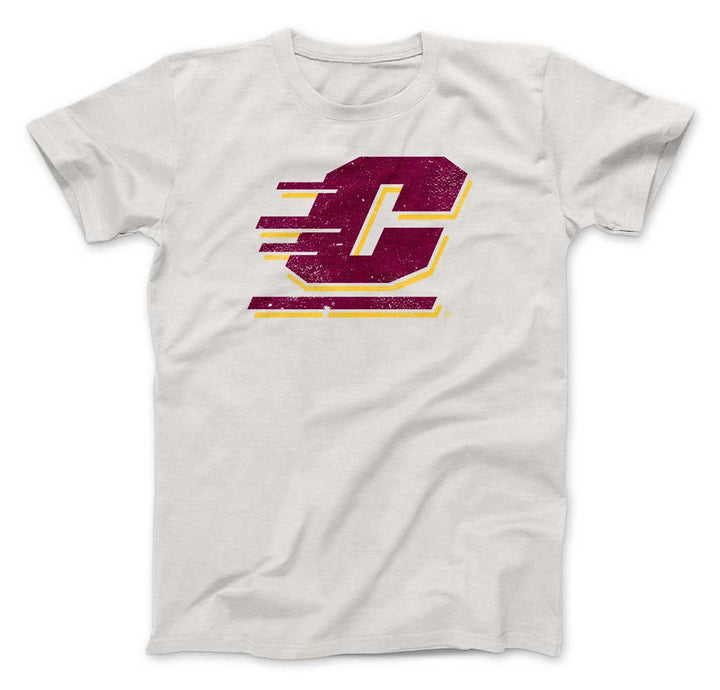
Unlike the design of the previous GVSU one, our new Kent State shirt is a study of simplicity. Blue wordmark in a very simple font that has a throwback feel, placed quietly on top of the Kent State thunderbolt in yellow.

Moving a few hours west to Bowling Green, we really strained from the norm by offering a new design on orange. We really don't have a lot of shirts on bright garments, especially considering our other 2 BGSU shirts are charcoal and the long sleeve is on brown, but we're shaking it up because how else are you going to get on TV during mid-week MACTION?

Staying in northern Ohio, we also retired our Cleveland State Magnus design in favor of a more recognizable logo that has Magnus peeking over the wordmark on a green shirt. For a smaller school like Cleveland State, we felt that most fans and alumni would want a design that names the school rather than just a big Viking (although that's still a cool design, and you guessed it, is available in clearance while supplies last).

Moving down I-71 South to Xavier, we also strayed from the traditional charcoal in favor of a really nice shade of "Columbia" blue and used the entire wordmark. One of my favorite parts of their branding is the detail involved in the Musketeer sword and that it's just so different from so many other college mascots, so we included all of it together in dark navy and white. This is a combination of the new and old design styles; more muted colors but on a brighter shirt.

A Big East opponent of Xavier, we also released a new Butler Bulldog shirt. Everyone knows Butler for 2 things - almost beating Duke in the 2010 Finals and their adorable live mascot Butler Blue. We pay homage to that live mascot with this silhouette profile on navy.

Moving south to Texas, we added our 4th (!) shirt for Baylor, who is still selling well coming off of their men's basketball national title. This is original in the sense that the design isn't in their branding guide but not brand new original like Kent State's or Grand Valley's; we took the Bear head (which is popular in its own right on a t-shirt) and the "Sic 'Em" phrase in green and put it together on gold. Loud and proud.

Staying in the Lone Star State, we also added our 4th shirt for Texas State and our second on a maroon t-shirt. Texas State released a bevy of new logos and designs in the new year, one of which was a newly animated version of Boko, their mascot. We took Boko's face and head and made it a simple two-color of brown and white and used the maroon shirt to fill in the rest. Once spring football practice began, we saw that the team wears a similar design on workout gear. That tells us we're on the right track.

Moving to northern Texas (guess where we're headed), we released another North Texas shirt, mimicking our best selling car decal. On a bright Kelly green, we printed the block UNT and diving eagle combo logo in white. It's so simple and an incredible complement to our green-on-charcoal original.

Last but not least, we also released a new vintage feel design for West Point in all gold on black. The Mule over the A is another one of those designs that you just don't see in college athletics anymore, so we captured it for the t-shirt. It is our 3rd West Point design and while it does well, it doesn't come close to the classic charcoal shield (nothing does, it was our 2nd-best seller in terms of units sold in Q2 2021).
So there you have it - over a dozen new shirts, many of which are on shirt colors we have never used before (orange, gold, Columbia blue, Kelly green, etc.).
New Decals
I won't highlight each individual new decal like I did shirt, but as I was driving around the state on the 4th of July weekend, I noticed how many cars have simple die-cut style white decals. Combine that information with the fact that our white Great Lakes decal is the best selling Great Lakes decal, we decided to offer more all-white die-cut style decals (by die-cut I mean we remove all excess vinyl so all that goes on the car is the design itself) for almost every license we have and we are adding and designing more every day. It is my hope that soon enough you can have the choice between full color and die-cut white in every decal design (easier said than done), because that maximizes the amount of backgrounds you can use and surfaces you can apply it to.
With football season (and more importantly, tailgating season) around the corner, we are also going to be ramping up our 'bundling' options, but more on that to come later! Thank you as always for your continued support and positive feedback. We wouldn't be able to sell any of these products if it weren't for you!
Leave a comment